The
exhibition in Veldhoven is already a long time ago but until now I haven’t had
time to show my contribution on my weblog. The theme was ‘Old Masters”. A while
ago I dyed a piece of fabric, which in my opinion looked as a sky with clouds.
In combination with the theme of the exhibition it inspired me to go loose on a
ceiling with angels. In the collection of the Amsterdam Rijksmuseum I found an etch
of Jacob de Wit (the lower one) and on the site Wikimedia Commons an etches of
Wenceslas Hollar. I enlarged the pictures and painted them on fabric. After
that I appliqued them on the sky fabric. In the old Amsterdam canal houses this
kind of panels where used in wooden or sculptured ceiling panels. So I made a
brown ‘wooden’ frame around it.
Posts tonen met het label quilts. Alle posts tonen
zondag 30 november 2014
Achter de feiten aanlopen / Overtaken by events
De tentoonstelling in Veldhoven is al lang weer voorbij maar
tot nu toe geen tijd gehad mijn bijdrage even te laten zien. Het thema was ‘Old
Masters’. Een lap die ik een tijdje
terug geverfd had vond ik net een wolkenlucht. In combinatie met het thema van
de tentoonstelling inspireerde met dat tot losgaan los gaan op een plafond met
engeltjes. In de collectie van het Rijksmuseum vond ik een ets van Jacob de Wit
(de onderste) en op de site van Wikimedia Commons etsen van Wenceslas Hollar.
De afbeeldingen vergroot en op stof geschilderd. De engeltjes op de luchtlap geappliqueerd.
In Amsterdamse grachtenpanden werden dit soort panelen vaak tussen houten
plafond panelen gezet. Vandaar de bruine ‘houten’ rand.
The
exhibition in Veldhoven is already a long time ago but until now I haven’t had
time to show my contribution on my weblog. The theme was ‘Old Masters”. A while
ago I dyed a piece of fabric, which in my opinion looked as a sky with clouds.
In combination with the theme of the exhibition it inspired me to go loose on a
ceiling with angels. In the collection of the Amsterdam Rijksmuseum I found an etch
of Jacob de Wit (the lower one) and on the site Wikimedia Commons an etches of
Wenceslas Hollar. I enlarged the pictures and painted them on fabric. After
that I appliqued them on the sky fabric. In the old Amsterdam canal houses this
kind of panels where used in wooden or sculptured ceiling panels. So I made a
brown ‘wooden’ frame around it.
The
exhibition in Veldhoven is already a long time ago but until now I haven’t had
time to show my contribution on my weblog. The theme was ‘Old Masters”. A while
ago I dyed a piece of fabric, which in my opinion looked as a sky with clouds.
In combination with the theme of the exhibition it inspired me to go loose on a
ceiling with angels. In the collection of the Amsterdam Rijksmuseum I found an etch
of Jacob de Wit (the lower one) and on the site Wikimedia Commons an etches of
Wenceslas Hollar. I enlarged the pictures and painted them on fabric. After
that I appliqued them on the sky fabric. In the old Amsterdam canal houses this
kind of panels where used in wooden or sculptured ceiling panels. So I made a
brown ‘wooden’ frame around it. vrijdag 12 april 2013
Werk in opdracht / work in commission
Als ik niet veel te doen heb dan doe ik ook inderdaad niet
veel. Als ik het daarentegen druk heb kan ik maar doorgaan. In dezelfde week
dat het boek bij de drukker moest liggen moest ook dit werk klaar zijn. Gelukt!
When I don’t
have any work to be done than I can be very lazy. But, when I am under pressure
I can continue endlessly. The same week the book had to go to the printers this
work should be finished as well. I’ve done it!
<<
Het veld zonnebloemen is willekeurig voorzien van gele
vlakken en daaroverheen een zeefdruk van zonnebloemen.
The large
sunflower on the left and the overblown sunflower on the right are painted on
fabric first.
The field
with sunflowers is random dyed yellow with a screen print above.
donderdag 28 februari 2013
Mother Earth II
Bij Mother Earth II blijf ik bij de breukvlakken van de
aardkorst. Langs deze breukvlakken is veel vulkanische activiteit. Een vulkaan
dus deze keer.
De randen van de vulkaan blijven omhoog staan doordat er
ijzerdraad in verwerkt is. Aan de binnenkant gloeiende lava.
With Mother
Earth II I stayed with the tectonic plates. Along the edges of these plates there is a lot of volcanic activity. So I made a volcano.
The raised
edge are up because there is wire in. The inside is red-hot lava.
donderdag 13 september 2012
Back again!
Zo, dat was lang geleden dat ik op mijn weblog schreef. Ik
geloof dat ik even geen zin had in mijn weblog. De komende dagen maar eens goed
maken. In de zomervakantie niet veel uitgespookt. Het was ook veel lekkerder om
veel buiten te zijn. Gebruik gemaakt van het mooie weer om nog even te
breakdown printen. Uitgeprobeerd of de Color Magnet ook werkt met verdikte
verf. Ik zou verwachten van niet omdat de verdikte verf maar weinig zwevende
verfdeeltjes heeft. Bleek ook te kloppen. Het resultaat is zeer subtiel. In de
achtergrond zie je heel vaag kleine stipjes staan. Die had ik vooraf met de
Color Magnet op de stof gezeefdrukt. Ik denk dat deze delen pas bij het
uitspoelen kleur overgenomen hebben. Dus, als je op zoek bent naar een heel
vaag achtergrond patroontje, dan is dit de manier.
Long time since I wrote something on my weblog. I think I was a bit weblog tired during summer. I’ll try to fix that in the next few days. Didn’t do much during summer. Outside was better than inside. Because of the good weather I did some breakdown printing. I tried whether Color Magnet worked with thickened dye as well. I expected that it wouldn’t work because of the fact that tickened dye doesn’t have that much floating dye particles.
My expectation was right. The result is very subtle. In the background you can see very vague small circles. Before the breakdown printing I screen printed these on the fabric with Color Magnet. I think they dyed during rinsing. So, when you need a very subtle pattern, this is de way to achieve it.
Ik denk dat de deur van mijn naaimachine hok wel een week of
9 stijf dicht gezeten heeft. Het hoofd ging ondertussen gelukkig gewoon door. Ideeƫn
genoeg om uit te voeren. Omdat alles voor de vakantie zo’n beetje af was en de
rest een beetje stil gelegen heeft zijn alle ideeƫn ongeveer een gelijk
ontwikkelingsstadium. Vervelend als je net zin hebt om meters te maken achter
de naaimachine. Natuurlijk liggen er altijd hele stapels ongebruikte lappen,
daar maar wat vanaf gehaald. Ik had nog heel veel monoprint lapjes liggen. Een
klein quiltje, om even warm te draaien, en een wat grotere gemaakt. De lappen
een beetje bij elkaar gezocht en uitgelegd zonder al te veel na te denken over
het ontwerp. Ik had gewoon zin omn even meters te maken. Ondertussen staan er
weer allerlei andere leuke dingen in de steigers, daarover later meer.
I think the
door of my sewing room was closed for almost 9 weeks. In the meantime my head
was running through. Ideas enough. Because I finished most of my projects
before summer and didn’t start anything new during summer all the new ideas are
all in the same stage. Annoying when you are eager to use the sewing machine.
Of course I’ve got large piles of unused fabric so I reduced my stock a bit. I
had a lot of monoprints. Made a small one first, just to warm up and a larger
one. I searched for fabric that matched my color scheme and put them together
without bothering about the design, just had to produce something I guess.
Other new
projects started, more later.
woensdag 9 mei 2012
Midden in de drukte ... / Right in the middle of rushing ...
.
Toch nog maar even snel gedaan. Nu verder met inpakken voor
Karlsruhe. 20 werken en alles voor de workshop mee. Dat is niet zomaar
ingepakt!
... I just
thought about the fact that I forgot to show the photo of the finished Golden
Age piece.
Allthough in
a hurry I published it quickly. Now continuing to pack for Karlsruhe. With 20
quilts and a lot of stuff for the workshop it’s a hell of a job!dinsdag 13 maart 2012
Gouden Eeuw / Golden Age
Ik ben al een heel eind op gang met mijn Gouden Eeuw
project. Uitgangspunt van mijn werk was het gevoel dat ik altijd bij de Gouden Eeuw (17e eeuw) heb, allemaal sombere en donkere schilderijen met hier en daar een lichte vlek. Niet echt het werk waar ik fan van ben (sorry Rembrandt). En ja, ik weet ook wel dat ze oorspronkelijk niet zo geschilderd zijn maar door invloed van de tijd vies en donker geworden. Bovendien doorstonden de gebruikte pigmenten de tijd ook niet allemaal even goed. Per saldo dus een somber gevoel. Begonnen dus met een sombere, donkere lap.
I am making
good progress with my Golden Age project. Starting point was the feeling I always
have thinking of the Golden Age (17th century), a lot of dark and
gloomy paintings with lighter spots here and there. Not perticulary the work I
am a fan of (sorry Rembrandt). And yes, sure I know that they weren’t painted
like that originally but darkend through dirt and time. In addition the
pigments used withstand time with varying success. On balance a somber feeling.
So I started with a dark dyed piece of fabric.
Voor mij als geboren Amsterdamse kon het thema niet
uitgewerkt worden zonder Amsterdam in het centrum te zetten. Amsterdam was in
die tijd tenslotte ook het centrum van de wereldhandel. Hoe meer ik over de
Gouden Eeuw las des te rafeliger werd het gouden randje van die Gouden Eeuw. Al
die rijkdom en welvaart werd bereikt door een flinke portie uitbuiting en
slavernij. Een klein deel van de mensen was rijk en welvarend maar daar
tegenover stond het overgrote deel van de bevolking die maar zijdelings mee
profiteerde van die rijkdom. Om nog maar niet te spreken over alle neveneffecten
van de handel in de kolonien en andere geconfisqueerde gebieden.
For me,
born in Amsterdam, the theme couldn’t be developed without adding Amsterdam to
it. In that time Amsterdam was the center of world trade. The more I read about
the Golden Age the more frayed the golden edge of the Golden Ages became. All
of the wealth and prosperity was achieved with help of a lot of slavery and
exploitation. A small number of people were rich and wealthy but at the
opposite stood a much larger part of the population that only sideways had
advantage. Not to mention all side effects of the world trade in the overseas
colonys and other occupied countries.
De Amsterdamse grachtengordel is voor een deel gebouwd in de
Gouden Eeuw en dat stukje Amsterdam is nog steeds de moeite waard om te
bekijken. De gevels van de grachtenpanden staan symbool voor de rijkdom en
wereldhandel, maar wat zit er allemaal achter?? Als symbool voor mijn ‘rafelige
randje’ heb ik de quilt doormidden geknipt. Hij heet ‘Behind the facades’.
Erachter een lap met steekwoorden over de keerzijde van de rijkdom. Nadat ik de
achterste lap vast gezet had een spannend moment. De schaar zetten in de
bovenste laag van de quilt. Ik ben wel van de het type die dan net ergens iets
doorknipt dat echt vast had moeten blijven zitten. Gelukkig heb ik ook goede
dagen, dit was er zo een. Het effect is wel erg leuk. Ik heb geverfd perle
garen in de spoel van de naaimachine gedaan om de dikke draden aan de open kant
te krijgen. Geeft wel een mooi effect.
The
Amsterdam canal area was build mainly during the Golden Ages and that part of
Amsterdam still is worth sightseeing. The fronts of the houses still are a
symbol for the wealth and world trade. But what’s behind all that?? As a symbol
for my ‘frayed golden edge’ I cut the quilt. It’s called ‘Behind the facades’.
In the back a piece of fabric with keywords about the drawback of wealth. I am the type of persons who cuts pieces that should’t be cut at all. Luckely I have perfect days as well, this was one of them. The effect is nice. I put dyed perle yarn in the bobbin of the machine to make the thick treads at the back. Looks good.
donderdag 16 februari 2012
I'm just messing around a bit …
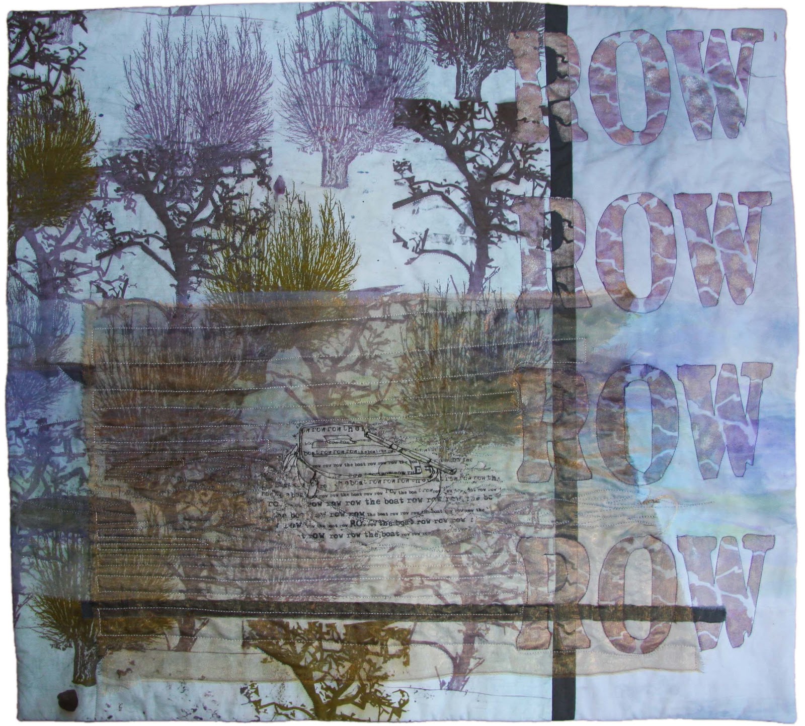
Er liggen nog een aantal dingen om af te maken. De laatste
roeiboot is klaar. Afzinken dat thema.
I have to
finish some quilts. The last one of the rowing theme is finished. The theme may
have to sink now, it’s milked out.
Mijn varen quilt wordt een beetje een suf ding. Er mist nog
het nodige contrast. Ben nu eerst bezig om met de hand steekjes te maken.
Daarna moet het varenblad in het midden (dat op de grote foto amper zichtbaar
is) nog een likje verf hebben. Ondertussen is mijn printer gemaakt maar heb ik
niet zo’n zin meer om mijn landschapje af te maken. Heb ondertussen al helemaal
in mijn hoofd zitten wat ik met de Gouden Eeuw ga doen en dat staat te dringen
om uit mijn hoofd te komen. Ben altijd bang dat als ik er dan niet gauw aan
beging het idee ineens verdwenen is. Zal wel niet maar ik ga er maar niet op
gokken.
The fern
quilt is becoming a bit dull. It’s suffering from a lack of contrast. I am busy
making seed stitches. After that the fern leaf in the middle (the one that’s
not visible now) should get some paint. In the mean time my printer is repaired
but am not willing to finisch my landscape. My head is full of what I should
make of the Golden Age theme. It’s pushing it’s way outside. I am always afraid
that the idea will disappear when I am not letting it out. I guess it won’t but
I don’t want to gamble on that.dinsdag 31 januari 2012
Rowing under the moon, finished, for now …
Ondertussen weer lekker bezig. Nu met 4 quilts tegelijk. Ik
wilde foto prints combineren in mijn landschapsquilt. Foto’s bewerkt, er
helemaal klaar voor, printer stuk. Dat is dus al de tweede keer in korte tijd.
Gelukkig nog net binnen de garantie. Meestal ben ik zo’n figuur die een week na
het verstrijken van de garantie iets kapot heeft. Valt dus mee deze keer.
Dat dus maar even aan de kant gegooid. Nieuwe quilt
begonnen. Voelde me wel verplicht iets met de monoprint lapjes te gaan doen.
Een leuke zijweg van mijn roeibootjes gevonden, daarmee kan je namelijk varen.
En dus ben ik met varen prints in de weer.
In the mean
time I was really getting on. With 4 quilts at a time. I wanted to combine
photo prints in my landscape quilt. Did some photo editing, and was all ready
for it, than the printer broke down. That’s the second time in a short notice.
Fortunately just with the warranty period. Most of the time I a person who’s
stuffs breaks down a week after the warranty. So it might have been worse. So,
put the landscape aside. Started a new quilt. I felt obliged to work with my monoprints.
Found a nice side-road from my rowing boat series. With boats you could sail
and the Dutch word for sailing is ‘varen’ which is the Dutch word for Vern as
well. So still busy with ‘varen’.
Als ik de hele boel zo bekijk begin ik een beetje genoeg te
krijgen van alle blauw groen bruine werken van de laatste tijd. Ooit bewust mee
begonnen om van mijn rood verslaving af te komen. Is wel gelukt dus nu snel
terug naar rood. Ergens in mijn achterhoofd borrelen al weer wat ideeƫn op. Ik
moet namelijk nodig aan het TeXperanto thema Gouden Eeuw beginnen. Daar moet
rood toch wel in te verwerken zijn. Rood, bruin en goud spoken door mijn hoofd.
Dat wordt vast binnenkort concreet, nog maar even in het achterhoofd laten
zitten. Eerst de 4 onderhanden quilts maar eens afmaken.
‘Rowing under the moon’ is ongeveer klaar. In de weer
geweest met paintstiks om er wat maneschijn in te krijgen. Ik weet nog niet of
ik er zo tevreden mee ben. Even laten liggen en over een paar weken maar weer
naar kijken.
Overlooking
my last series of work I am starting to get bored of all the blue green brown
stuff. I once started this colour sceme deliberately to get rid of my red
addiction. Managed to that, so time to move on. Back to red. Somewhere in the back
of my mind some ideas are bubbling up. I should make a start with the
TeXperanto the ‘The Golden Age’. Red should be part of it I guess. Red, brown
and gold are coming to my mind. Will be clear soon, but kept in the back of my
mind for a whil. Have to finish the 4 present quilts first.
‘Rowing
under the moon’ is sort of finished. Reworked it with paintstik in order to add
some moonshine. Not sure wether I am satisfied. I’ll leave it like this for a
while and look again within a few weeks.
zondag 27 november 2011
Rowing again ...
Ik had nog wel wat inspiratie over op mijn roeibootjes
thema. Omdat ik mijn Rowing by night wel mysterieus vond besloot ik het
nachtelijke thema nogmaals te gebruiken. Nu gecombineerd met de maan. Ben er
nog niet helemaal tevreden over maar de maan die door de bomen schijnt past in
ieder geval bij de tijd van het jaar.
I had some
inspiration left of my Rowing thema. Because I like the mysterious look of my ‘Rowing
at night’ I decided to use the nightly theme again. Combined it with the moon.
I am not quit satisfied with it at all but the moon shining through the trees
fits the time of the year. In Holland we know Santa Claus but we also have the
feast of Sinterklaas. He celebrates his birthday (which is on the 6th
of Dezember) on the 5th of Dezember by bringing presents to the
children. One of the most famous Sinterklaas songs is about ‘to see the moon
shining through the trees’. So in our Dutch opinion this picture fits the time
of the year.
zaterdag 8 oktober 2011
Tweeluik / diptych
Grappig eigenlijk. Zo doe ik in geen maanden iets en zo maak
ik in 4 dagen 3 quilts. Maar goed dat het niet iedere week zo gaat want dan
puilde mijn kleine hokje helemaal uit van de spullen. Hier mijn tweeluik, ‘Rowing by day’ en ‘Rowing
at night’. Ik ben wel tevreden over dit stel.
Funny.
Sometimes I don’t make anything in months and then you’ll make 3 quilts in 4
days. It’s a good thing that’s not an every week job. My little room
will bulge out eventually.
Here’s my diptych, ‘Rowing by day’ and ‘Rowing at night’. I am satisfied with this couple.
woensdag 13 juli 2011
Finished
De rode franse knoopjes stellen klaprozen voor. Klaprozen die in de eerste wereldoorlog uitbundig bloeiden op de graven van omgekomen soldaten. Klaprozen houden erg van omgewoelde grond, vandaar. De grote letters in de achtergrond vormen de titel van een gedicht uit de eerste wereldoorlog.
A few weeks ago this ons was finished but I forgot to put a picture on my blog. My aim was to practice ‘less is more’. I think I’ve done that. The little French knots are poppies. Poppies that where blooming richely on the soldiers graves. They grow well on churned ground, that’s why. The big characters in the background are forming the title of a great war poem.
zaterdag 9 juli 2011
A bit of history
maandag 4 april 2011
TeXperanto again
Afgelopen zaterdag zijn we weer bij elkaar geweest met TeXperanto. Altijd weer een inspirerende dag. Iedereen komt toch steeds weer met hele verrassende ontwerpen op de proppen. We zijn nog steeds druk bezig met teksten en gedichten. Mijn klaprozen gedicht Flanders Fields was ook nog steeds ongoing business maar parallel eraan heb ik ook de quilt van mijn vader afgemaakt. Het was aflopen week 25 jaar geleden dat hij overleden was dus het leek me wel passend om hem dan ook af te hebben. En omdat er toch ook een gedicht op zit heb ik die ook maar even meegenomen. Het gedichtje komt uit mijn poƫzie album. Ik heb me vroeger dood geƫrgerd aan dit gedicht. Ik vroeg me altijd af waarom mijn vader niet gewoon een standaard gedichtje had kunnen schrijven. Ik weet nog dat ik op punt gestaan heb om de pagina dicht te plakken! Maar als ik het nu zo lees is het eigenlijk een prachtig en persoonlijk gedichtje:
Toch ben ik erg trots op mijn oudste
Want je doet je best veel te leren
Waar je later nog lang op kunt teren.
Ga zo door, want ik vind het zo fijn
Dat ik later ook trots op je kan zijn.
Toen de quilt af was bleek de uiteindelijke stof keuze voor de onder en bovenrand nog steeds een beetje te druk. Wist ik ook eigenlijk wel maar dat wilde ik even niet horen. ’s Avonds thuis een rigoureuze paintstik actie uitgevoerd. Met witte paintstik de donkere delen verzacht. Is wel beter.
Last Saturday we came together with our textile art group TeXperanto. As always an inspiring day. Everybody keeps popping up with wonderful and surprising designs.
We are still busy with text and poems. My poppy poem Flanders Fields was still ongoing business as well.
Parallel I made a quilt about my father. Since it was 25 years ago this week that he died it seemed appropriate to finish the quilt this week. On this one is a poem as well. My father wrote it for me in my ‘poezie album’ . Don’t know if you know this phenomenon too, but in my youth it was common to have a little album in which all your friends and family wrote a little poem for you accompanied with some pictures or drawings.
Most of the time you’d use some ‘standard poems’’. My father wrote me a personal one he composed himself. All my youth I wondered why he didn’t use a standard poem but now I appreciate it very much.
After I finished the quilt the fabric on the top and bottom was too loud. I already knew but didn’t want to hear it. The same evening I did a rigorous paintstik action. With white paintstik I softened it a bit. That’s better.
Basis voor beide is een lap met de titel van het gedicht in grote letters erop gesjabloneerd. Het eerste werk heeft daaroverheen een transparante laag met geborduurde klaprozen. Tijdens de bijeenkomst draaide een
van de dames de transparante lap om. Nooit aan gedacht maar het gaf wel een prachtig subtiel effect. Dat laat ik lekker zo.
Both have got the same basic fabric: a light background with the title of the poem in large capitals stencilled on. The first one has got a transparent second layer with embroidered poppies.
During the meeting one of the ladies turned de transparent layer. Never thought off but the effect was very subtle. I will leave it that way.

De andere lap heeft dus dezelfde tekst als achtergrond. Op de voorgrond silhouetten van marcherende soldaten. De zwarte ondergrond ga ik doorstikken met grijs zwart garen. In de achtergrond komen graf kruizen en ik maak er met borduurgaren nog rode klaproosjes bij.
So the other one has got the same background. I made a silhouette of marching soldiers. The black part will be stitched through with gray black yarn. There will be crosses in the background and I will embroider little poppies between them.
vrijdag 18 maart 2011
Daddy
Als je met allemaal van die textiele dames in een huis zit heeft iedereen natuurlijk een mandje/kistje/tasje met ‘iets om handen’ mee. Zie het kistje en je leert een heleboel over een persoon. Op zich vind ik het altijd wel prettig werken om per project zo’n kistje te hebben. Ik stop er altijd allerlei garens en draadjes van de juiste kleur in. Ook erg leuk om in iemands anders kistje te snuffelen of er iets bruikbaars in zit. Ik had de quilt in wording van mijn vader meegenomen. Toch gekozen voor de lichte bovenrand en de gele rand erin gelaten. Het geel wel een beetje afgezwakt zodat het iets minder nadrukkelijk aanwezig was. Voor nu laat ik het maar zo, mocht het uiteindelijk te geel zijn dan doe ik er nog wel een laagje van het een of ander overheen. Het hoofd van mijn vader vooraf thuis nog met de machine gestikt (staat niet op de foto, komt later) (klinkt trouwens tamelijk luguber, een hoofd stikken). Verder heerlijk met de hand zitten quilten (alweer!). Ondertussen ook nog een proefje gemaakt met machinaal borduren. De wilgen uit het plaatje omgezet in een borduurpatroon en daarna geverfd. Denk niet dat ik het op deze manier ga gebruiken. Wordt een beetje druk. Wordt vervolgd.
When you are in the same house with other textile ladies everyone brings a box, bag or something with her with ‘something to do’. Look at the box and you learn a lot about the owner! I like to work with a box for every project. I stuff it with all kinds of yarns and threads of the right colours. It’s fun to look in another one’s box to see whether there is something you can use in it. I brought the quilt to be of my father with me. Finally I choose for the lighter upper part and left the yellow part in. I softened the tone a bit so it was less emphasized. For now I leave it like this. When it’s too yellow I’ll deal with that later on. I machine quilted my fathers head (not seen on this photo) (It sounds a bit sinister, stitching someone’s head). I did some hand quilting as well (again!). In the mean time I did a little experiment with machine embroidery. I made an embroidery pattern from the willows and painted the result. Don’t think I will use it this way, a bit to busy. To be continued.
donderdag 17 maart 2011
Finished Labyrinth
Afgelopen dagen lekker aan zee doorgebracht. Zo maar zonder de rest van de familie maar met mijn ‘quilt familie’, Willy, Emmy en Tineke. We waren bij elkaar gekomen om elkaar de uitwerking van Labyrinth aan elkaar te laten zien. De ambiance was prima in orde, aan het strand in Noordwijk. Gelukkig was het ook nog eens prachtig weer.Last few days I spent at sea. Without the rest of my family but with my ‘quilt family’Willy, Emmy and Tineke. We met to show each other the labyrinth quilts. The setting was magnificent, at the beach in Noordwijk (Dutch North Sea coast).
Het leek ons een fijn plan om de quilts op het strand te fotograferen. De wind gooide echter roet in het eten. Deze foto is precies in die tien seconden gemaakt dat alles goed bleef hangen. De anderen laten vast ook nog foto’s van hun eigen werk op hun blog zien dus ik laat alleen een ‘verweg foto’ zien. The weather was beautiful. It seemed a good plan to make photos of the quilts at the beach but the wind was ruined that a bit. The photo is of the ten seconds everything stayed on the fench. The others will show there own quilts on their blogs so I’ll only show ‘a faraway picture’.
Ik heb het thema Labyrinth uitgewerkt als ‘de weg is belangrijker dan het uiteindelijke doel’.
Het grote labyrint is een afbeelding van het vingerlabyrint uit de kathedraal van Lucca.
Links zie je geborduurde labyrinten die steeds een beetje vager worden, na een tijdje staan het doel niet altijd even goed meer voor over. Bij het quilten zijn cirkels uitgespaard. Dit staat voor ‘vage doelen’ waar nog niets mee gedaan is.
De quilt kleurde in ieder geval prachtig bij het strand.
Aan mij ook de eer een nieuwe uitdaging te bedenken. In het licht van alle afschuwelijke gebeurtenissen in Japan heb ik gekozen voor ‘De kracht van de aarde’. Ben nu al nieuwsgierig hoe iedereen dat weer gaat uitwerken.
But, of course I can show my own quilt now.
I worked the theme out as ‘the journey is way more important than the final destination’. The large labyrinth is based on a picture of the finger labyrinth of Lucca’s cathedral (Italy).
At the left you can see embroidered labyrinths which became more vague every time. This stands for the fact that in time goals we be less concrete. In the quilting circles are left blank, this stands for the vague goals you haven’t done anything with. The colour of the quilt beautifully matched the beach.
This time I had to think of a new challenge. In the light of events in Japan I choose ‘The power of the earth’. I am already curious what everyone will make of that.
woensdag 9 maart 2011
Change of plans

Ik had me nog zo voorgenomen om alleen de lappen te gebruiken die ik vooraf klaar gelegd had. Niet dus. De lap bleek veel te druk (zie eerste foto). De plaatjes gingen op deze manier geheel op in de achtergrond. Toch maar een aantal rustigere lapjes gepakt. Nog een beetje geƫxperimenteerd met donkere en lichtere tinten (foto 2 en 3). Ik denk dat het de derde gaat worden.
I intended to use only the fabric I choose in front. But no. change of plans. The fabric was much to noisy (see first picture). The background became more important than the photo. So I decided to look for some other pieces of fabric. Experimented some with darker and lighter colours. I think the third one will be the starting point.zaterdag 26 februari 2011
Keep it simple, that's not easy
Over het algemeen heb ik de neiging om vrij druk werk te maken. Ik word dus regelmatig om de oren geslagen met opmerkingen als ‘hou het simpel’. ‘less is more’. Lastig dus om een evenwicht te vinden tussen wat je zelf prettig werken vindt en het geheel niet te druk te maken. Mezelf maar eens de uitdaging gesteld met weinig materiaal een consistent geheel te maken. Toen ik een tijdje terug mijn toen nog nieuwe printer aan het uitproberen was had ik een aantal afdrukken van gemanipuleerde foto’s gemaakt. Ik was nieuwsgierig welke mate van detail nog goed terug te zien was op de stof. Ik verwachtte dat door de structuur van de stof er detail zou verdwijnen, dat bleek mee te vallen. Als test printte ik een deel van een landkaart over een foto heen. Tot aan de kleine lettertjes leesbaar gebleven. Twee van deze foto’s gepakt en een lap stof die een beetje rommelig geverfd is maar wel in de kleuren van de foto’s. Weet nog niet wat het wordt maar wel dat het van deze lapjes gemaakt gaat worden, het is in ieder geval een begin.
De foto’s zijn niet helemaal toevallig bij elkaar gekozen. Op een van de foto’s staat mijn vader. Hij leeft helaas niet meer maar was tijdens zijn leven altijd bezig met natuurbeheer. En dan met name met het onderhoud van wilgen. Op de achtergrond staan geknotte wilgen en de landkaart is van de omgeving waar hij altijd bezig was. Most of the time I have a tendency to make a bit noisy work. So regularly someone is making remarks as ‘keep it simple’ and ‘less is more’. So for me it’s hard to find the balance between what I like to make and not too noisy. I gave myself the challenge to make a consistent work with a little variety of material.
When I was testing my new printer a while ago I made some prints of manipulated photos. I was curious how much detail you could see on fabric. I expected that because of the structure of fabric much of the detailing would disappear, but turned out better than expected. I used a map as test. I made a map layer over a manipulated photo. Even the fine prints where readable. I choose two photos and a dyed piece of fabric. The fabric was a bit messy dyed but had the right colours to match the photos. Don’t now exactly how this will end but at least t
here is a start!
here is a start!The choice of this set of photos is not quit by coincidence. On one of them is a picture of my father. Sadly he isn’t alive anymore but he was always busy with nature conservation. Especially the pollarding of willows. In the background are some willows and the map is of the surroundings he worked in.
Abonneren op:
Posts (Atom)